Tuesday, April 16, 2013

Choropleth Map: Nominal

http://factsanddetails.com/Asian.php?itemid=2763&catid=66&subcatid=419
Nominal choropleth maps are simply maps that display areal data that is of the nominal nature, meaning the data is categorical or qualitative rather than has a specific order to it. This map of china portrays the areal spread of top known minorities living in China. Its data is strictly nominal because it is completely qualitative, focusing on race rather than quantitative or numerical data. 

Parallel Coordinate Plot

http://en.wikipedia.org/wiki/Parallel_coordinates
Parallel coordinate plots are often used explore relationships among variables. In a sense, one observed subject conveyed in a parallel coordinate plot could be thought similar to one star plot. Each vertical axis represents a range of values for one variable, and the corresponding values for an observation are plotted along them and connected with a line. This plot represents data from a study of three different flowers: setosa, versicolor, and virginica. The four variables were: sepal width, sepal length, petal width, and petal length. From the multitude of samples, you can see that setosa had the shortest petals, followed by versicolor, then virginica with the longest petals of the three species.

Index Value Plot

http://www.nature.com/ngeo/journal/v4/n11/fig_tab/ngeo1296_F3.html
Index value plots use index values instead of absolute numbers. For example, they would be useful to predict a trend past the point of completion for a particular study, using an average from the time period of the study then comparing the actuality of continuing events to the predicted behavior of the graph. These index value plots have done just that with the standard deviations of emissions of ozone-depleting substances and greenhouse gases between 1970 and 2010 (when the study was done) and then projected the standard deviations into the future up to 2090.

Bilateral Graph

http://www.dailykos.com/story/2005/03/10/98336/-Greenspan-s-bubbles-more-graphs
Bilateral graphs are used to graph data with two related variables within the same time period. The two lines are usually trending inversely (one negatively and one positively) and intersect and produce two overlapping areas. This graph looks at U.S. real private consumption relative to global real GDP in relation to the U.S. trade balance. In February 2005, while the real private consumption relative to global real GDP increased, the trade balance decreased. The overlapping area to the left of the intersection shows net loss while the area to the right shows net gain.

Isopleths

http://cimss.ssec.wisc.edu/oakfield/meso/12dewsfc.gif
On an isoline map, we see the lines that connect areas with like response values to the question of study. Those lines, in any isoline map, are called isopleths. They have different names in some weather maps or geological maps, but in general, they are called isopleths. The isopleths on this map from July 16, 1996, connect areas with equal surface dewpoint temperature values.

Choropleth Map: Unstandardized

http://www.sitemaker.umich.edu/356.haas/files/us_map.jpg
An unstandardized choropleth map represents data that is not areally averaged. They display data in its raw form. This map of percentage of Spaniards in each state in 2000 is unstandardized because even though there are classification intervals, each state is labled with its actual percentage so the raw data is still observable.

Choropleth Map: Standardized

http://envis.praha-mesto.cz/rocenky/Envi97/img/6-02.gif
Standardized is the title given to choropleth maps that are areally averaged. Usually, they represent data about density or percentages. This map demonstrates areally averaged data from the study of population density in municipal districts of Prague in 1996. It's averaged because the population of each municipal districts is relativized by inhabitants per square kilometers. 

Lorenz Curve

http://www.ssc.ca/en/education/archived-case-studies/case-studies-for-the-2003-annual-meeting-neighbourhood-factors-and-children
A Lorenz Curve, or accumulative line graph, is used to compare actual dispersion of an entity (typically wealth) to how it would be if the entity were distributed evenly or equally amongst the subjects. Thus, it illustrates inequality well. This Lorenz Curve illustrates the unequal distribution of cumulative income. The downward bending indicates low portion of the population attaining high amounts of the wealth. These graphs are useful for economists and policy makers when it comes to salary etc.

Similarity Plots

Similarity grids are visualization tools used to compare likeness between two differing entities. Using a color gradient to represent high-to-low similarity, it becomes simple to see how alike the two observations in question are. This matrix compares the phenotypes of ten different bacterial strains. The scale on the right indicates percent similarity between each strain. For example, strain 7 is from 30-39 % similar to strain 3.

Box Plot

http://grasswiki.osgeo.org/wiki/R_statistics
Box plots can be very useful when comparing multiple sets of data. They provide a simple summary of dispersion and show means of center as well (average and median). Each box plot separates its data into percentiles, usually noting 25th, 50th (center), and 75th quartiles as the three horizontal lines making up the box. These box plots are representations of geologic types at differing elevations. Each type of rock (and a mixture of a couple of types) has its own box plot. From this study, one can see that the 50th percentile of metamorphic rocks occurred just above 1600 ft, while the 50th AND 75th percentile of sand occurred just below 1200 ft.

Population Profile

http://www.scalloway.org.uk/popu4.htm
When profiling a population, often a population pyramid is used to display the frequency (in intervals) of ages, men and women, from any particular region. They look like vertical, back-to-back histograms. This population pyramid is a generalized example of a population dispersion one might find analyzing at a typical developing country. The wide bases indicate that the majority of the population are children, from new born babies or infants to four-year-old's. Only about 8% of the entire population consists of males and females between the ages of 25 and 29.

Scatterplot

http://www.cawcr.gov.au/projects/verification/
A scatter plot is a graph that plots points "scattered" amongst a Cartesian plain. Their values are assigned by a predictor variable and response variable. If the points are closely correlated enough, a trend line may be appointed for averaging out and purposes of analyzing the trend of the data. For example, this graph shows 10 observed temperatures in degrees Celsius and compares it to the forecast temperatures for the days. The response variable points (y) did show a trend in correlation to the predictor variable (x), so the trend line was drawn. Here there is a positive correlation between observed and forecast temperatures.

Monday, April 15, 2013

Climograph

https://sites.google.com/site/comparingclimates/
A climograph represents and compares monthly temperatures and precipitation in a year to help more accurately determine an area's average climate. This is a climograph of Singapore. The bars represent cumulation of rainfall each month in cm and the dotted line represents monthly temperature averages in degrees Celsius. 

Choropleth Map: Bivariate

http://www.personal.psu.edu/faculty/c/a/cab38/GEOG321/14_multivariate02/multivariate.html
A bivariate choropleth map represents areal data from observations with two variables each instead of just one (univariate). This map of the United States is bivariate because the study monitored observations with two variables: people per square mile in 1990 and the percent change in population from then to 2000. This allows the reader to compare the population for the two years as well as understand the trend of the population change.

Choropleth Map: Univariate

http://www.geography.org.uk/cpdevents/onlinecpd/gis/webbasedtools/
A univariate choropleth map refers to a map that conveys areal data from a study in which each observation has only one variable; the same variable. This map of Scotland is a univariate choropleth because the only variable it conveys is the unemployment in 2006.

Star Plot

http://en.wikipedia.org/wiki/Radar_chart
Star plots make it possible to visualize and compare multiple variables at once from each particular observation. Each variable is depicted as a radius stemming from a center point and all radii may and most likely will be of different lengths. These are star plots of fifteen different cars, each with 9 radii so each observation held 9 different variables. The variables (note the radii numerical guide of the AMC Concord plot) were, in this order from 1-9: price, mileage (MPG), 1978 repair record, 1977 repair record, headroom, rear seat room, trunk space, weight, and length. So, while noting all of these variables for each car, star plots help to visually compare each variable for each car.

Triangular Plot

http://www.sciencedirect.com/science/article/pii/S0375650505000386
Another geovisualization tool is a triangular plot. These are helpful when looking at composition, typically in percentages, of something, mostly natural entities like soil or water. This triangular plot measures the chemical components in milliequivalent per litre of groundwater and thermal springs taken from the Cornia plain in Tuscany, Italy. The points represent samples taken and their content can be understood by, tracing back to each side of the triangle, finding the values on which axis they lie. 

Stem and Leaf Plots

http://blog.wolfire.com/2009/02/design-principles-from-tufte/
Stem and Leaf Plots are another graphical tool used to visualize frequency statistics. These examine groups of numbers and sort them out based on their first digits, then further sorts them using the rest of them. They allow you to visualize how many times a particular number occurred for the units. This stem and leaf plot measures heights of 218 volcanoes in 100's of feet, so it is truly useful for geovisualization. The top line suggests that there was one volcano each for the heights of 900 ft, 800 ft, 700 ft, 500 ft, and 200 ft, while three volcanoes stood 600 ft tall. Just from looking at this plot, one could make an educated guess about the mean and median height of volcanoes being somewhere between 5000-7000 ft.

Wind Rose

http://alternativeenergyatunc.wordpress.com/2010/03/16/wind-roses/
A wind rose is a type of geovisualization plot used to track the wind patterns and frequencies. This wind rose represents data taken from July 21, 2006 to December 31, 2008. Analysis of this plot will show that during this time period, 9.3% of the time the wind blew from the northwest at speeds between 10 and 20 miles per hour.  

Histogram

http://www.geography-fieldwork.org/icefieldwork/glacial/stage4.htm#presentation
Histograms are graphs that display statistical data in terms of frequency. They can be thought of as tools for geovisualization for geographical studies. For example, this histogram represents the size and shape of sediments deposited after glaciation. The intervals are determined by a scale called the Cailleux Index which measures the roundness of pebbles. The most frequently occurring size of sediments from this study fell between 151 Ci and 200 Ci on this scale, while none fell between 751 Ci and 850 Ci.

Choropleth Map: Unclassed

http://go.owu.edu/~jbkrygie/krygier_html/geog_353/geog_353_lo/geog_353_lo07.html
In an unclassed choropleth map, the areal data being conveyed is not grouped into intervals to make the distinguishable factors on the map more generalized. The number of intervals is equal to the number of areal units. The map above shows an unclassified chorpleth map, as a continuous grey scale is used and wherever each county falls is shaded in with its own color. It is a far more hectic view of the counties in our nation than it would otherwise appear if the map was classed, implementing less intervals.

Choropleth Map: Classed

http://my.ilstu.edu/~jrcarter/Geo204/Choro/Tom/
While choropleth refers to any map that portrays areal data, whether it is classed or not distinguishes between different choropleth maps. The data on the map of California above is classed, meaning that the data it is portraying is grouped together in intervals by some particular method. There are multiple methods of grouping, or classifying, this data together, and whichever method to use is up to the cartographer, a lot of it depending on how many intervals are desired. The percent of Black condo owners in California is here classed into equal steps of 5%. The gap between each corresponding interval is numerically equal, so it is clear that the cartographer used the "equal steps" method of classification here.

Cadastral Map


http://www.icsm.gov.au/mapping/maps_cadastral.html
Cadastral maps, or land partitioning systems, are used to divide and depict areas in terms of property ownership as well as facilitate with purchasing, taxation, and planning. This map shows the land divided into separate parcels or plots available for ownership. Usually, boundaries take form of natural geologic, geographic, or ecological entities like trees, rivers, etc. 

Propaganda Map

Social media is notorious for propaganda, trying to manipulate readers or viewers into feeling a certain way or taking a certain side of an issue. Usually, this could mean shedding a false or biased light on a conflicting view. Maps are a great way for political leaders to influence their nations in times of war. This map of a viewpoint of western Europe from Moscow was used to convey the idea that the continent lay right in front of the Soviet Union at their feet, easy to "sweep over" with their armies.

Cartographic Animation

http://www.cg4tv.com/us-map-animated-background.html
Cartographic animations are used to convey the third dimension of a map in real time that may be continuously going. This animation when seen in motion features hundreds of bright lights that twinkle throughout the United States. I don't believe there is a particular study to this particular map, but it is useful for the idea of cartographic animation. An actual study that may result in something of this nature might be something like "credit card purchases over $1,000,000 by city live".

DOQQ


http://www.tceq.texas.gov/gis/doqtnrcc.html
DOQQs, Digital Orthographic Quarter-Quads, are fused images with characteristics of an aerial photograph and the geometric context of a map. Like DRGs and DEMs, they use raster format to store data. The images have been orthorectified from a distorted aerial photograph to a flat map, allowing for more accurate measuring of distance, angles, shape, area, and positions. This image of the football stadium at the University of Texas, Austin, is a DOQQ as it is and aerial shot of the area, and it's false infra-red color helps to delineate the photograph and orthorectify the image.

DEM


http://www.sarmap.ch/page.php?page=topography
DEMs, Digital Elevation Models, are yet another product of a U.S. Geologic Survey. They use raster-based image formatting and portray terrain elevation at regular horizontal intervals. They typically have an element of relief to them, in the form of shading or raised lines to produce a three-dimensional image. Observation of this digital elevation model of Switzerland can provide a better understanding of the three-dimensionality of these models, where here you can clearly see where the mountains lie in the country.

DLG


http://www.mapcruzin.com/free-geodata-shapefiles/usgs-geospatial-data-geodata-geographic-download.htm
DLGs, Digital Line Graphs, use vector format for storing geographic data. So, unlike DRG, their data is stored in points, lines, arcs, and polygons. They are georectified and can contain or convey a wide variety of geographic information, including topography, roads, hydrography, etc., so they are useful as well in many geographic information systems. This is a digital line graph of Spokane, Washington. 

DRG


http://www.tceq.texas.gov/gis/drg.html
DRG maps, or Digital Raster Graphic maps, are digital images obtained from scanning and georectifying a topographic map from a U.S. Geologic Survey (USGS). They are useful tools for many geographic information systems, as they use raster format technology, so the images are already coded in pixels. This DRG of the Colorado River is standard size of a USGS topo map: 7.5 x 7.5 minute boundaries.

Sunday, April 14, 2013

Isopachs

http://www.nvcc.edu/home/cbentley/gol_135/massanutten/massanutten.htm
Isopach lines connect points where the geologic thickness is virtually the same. On this map of Massachusetts, you can follow the lines to see where the underlain rock is the same thickness, from 30 meters to one meter. 

Isohyets

Giambelluca, T.W., Q. Chen, A.G. Frazier, J.P. Price, Y.-L. Chen, P.-S. Chu, J.K. Eischeid, and D.M. Delparte, 2012: Online Rainfall Atlas of Hawai‘i. Bull. Amer. Meteor. Soc., doi: 10.1175/BAMS-D-11-00228.1.
http://rainfall.geography.hawaii.edu/downloads.html
The lines on this map are called isohyets. They are used as a means of specifically showing rainfall and their lineage connects areas of like data for precipitation. The average rainfall in October 2011 for Kaua'i as shown here seems to depend on distance from the center of the island, where the outer edges recieved around 100 mm of rain while the middle received around 600 mm of rain.

Isotachs

http://www.erh.noaa.gov/gsp/localdat/cases/2008/28_April_KingsMtn_tor/KingsMtnTornado.html
Isotachs are much like isobars, in that their lineage connects points with like data. The differing factor here is that instead of pressure, isotachs convey wind speed. This weather map is from April 28, 2008. Analysis of this map will suggest that on this day, the wind speed was nearly the same throughout Oregon, Idaho and Colorado.

Isobars

https://www.nc-climate.ncsu.edu/edu/k12/.IsobarIsotherm
This weather map looks at the atmospheric pressure over the United States from July 14, 2009. The lines on this map are called isobars, and like the lines on an isoline map, they connect areas of like pressure. On this day, the pressure was high in Michigan, low in Arizona, but around the same in the middle of Texas and along the western border of Minnesota. 

Doppler Radar

http://www.noaanews.noaa.gov/stories2004/s2311.htm
Doppler radar images are generated from microwave emissions that track the water droplets in the atmosphere. This image of Hurricane Frances was taken in 2004 as the storm moved over Florida. The radar allows meteorologists to determine the speed and direction of the water and can then predict the nature  and paths of these storms.

Statistical Map

http://thinkafricapress.com/population-matters/revolutionary-certainty
Statistical maps convey statistical data for an area, typically numerical data. This map of Africa differentiates between areas by means of each region's youth literacy rates. Yellow areas have statistically shown less literate youths while the dark green colored areas have the highest literacy rates.

Cartogram

http://www.brainpickings.org/index.php/2010/04/15/cartograms/
Cartograms are used to convey information about a nation or state by distorting their true shape and size to fit the third dimension being observed. The world on this map is highly distorted to convey the populations of each nation. Although the size and shapes of the countries are false, it is easy to see that China has the greatest population with India following not too far behind. 

Isoline Map

http://www.nzdl.org/gsdlmod?e=d-00000-00---off-0ccgi--00-0----0-10-0---0---0direct-10---4-------0-0l--11-en-50---20-help---00-0-1-00-0-0-11-1-0utfZz-8-00&a=d&c=ccgi&cl=CL2.5&d=HASH01815a5264fa0f4bfa328693.8
Isoline maps convey numerical or statistical data using lines that cover areas on the map with like numerical data. This map of China represents annual precipitation in the region. The lines connect areas with like rainfall, so where there is annual rainfall of about 400 mm, you can follow the line to see where else the annual rainfall is about 400 mm.

Hypsometric Map

http://www.fs.fed.us/ne/morgantown/4557/gypsymth/ddmap.html
Hypsometric maps show the surface but add a third dimension to the picture by using relief, whether they do so using contour or raised lines, colors, etc. This map depicts the study of "annual average accumulated degree-days above a 40 degree F." The number of accumulated days is the third dimension in the map and to distinguish between the numbers, they used a color gradient. Areas shaded black have zero days while areas shaded in a bright lime green have up to 13500. 

Saturday, April 13, 2013

PLSS

http://www.kitsapgov.com/gis/maplibrary/
This map of Kitsap County in Washington demonstrates the purpose of PLSS, Public Land Survey system. The system is a gridded land partitioning system used to divide and further divide land, distinguishing them as townships and then further dividing even these plots up as well into 36 quarters or quadrants one square mile in size. The grid makes distinguishing land areas clearer and more structured. You can see on this map how each square is broken down into more squares over the area.

LIDAR Image

http://www.noaanews.noaa.gov/stories/s798.htm

LIDAR is a tool used on satellites for remote sensing. It is a form of active remote sensing, because in order to obtain the image the LIDAR emits wavelengths of a laser that are absorbed and reflected back to the sensor by the entities on the ground. Much like sonar and radar, it uses reflection time to see distance and can generate an image of the land below in a three-dimensional manner. This is a LIDAR image of Manhattan from September 27, 2001. If you look closely near the center of the photo, you can see the empty crater that is Ground Zero, where the World Trade Center fell just weeks before.

Tuesday, April 9, 2013

Black and White Aerial Photograph

http://casde.unl.edu/imagery/cir/index.php?county=greeley&city=scotia
Unlike infrared photography, a black and white aerial photograph does not distinguish well between vegetations, lands and waters. The wavelengths they can communicate are very near those as human vision, so the acuteness and details of the photographs are not as helpful for reading the photo as a map. This photo was taken from a satellite remote sensor as well as the infrared photo, but clearly is not as easy to understand, where perhaps, water ends and land begins.

Infrared Aerial Photograph

http://casde.unl.edu/imagery/cir/index.php?county=greeley&city=scotia
This infra-red aerial photo of Scotia, Nebraska was taken from a satellite that orbited the Earth in 2010. Infrared photographs are useful for distinguishing between vegetations, waters, and lands; especially helpful for those that would appear the same shade in black and white photographs. The film used for these photographs is coated with a special emulsion that absorbs and translates areas of the magnetic spectrum outside of human eyesight. These photos make it easier for us to see landscapes more accurately, and therefore are more clearly understandable as maps. 

Choropleth Map

http://www.nevron.com/Gallery.DiagramFor.NET.Maps.GeneralMaps.aspx
Choropleth maps are tools used to show and distribute data areally. Usually, areas are defined by boundaries such as states, provinces, counties, etc. This particular map is showing the population in each of eight separate "territories" that divide Australia. The sections are distinguishable by color. Where each of the boundaries exist, the data from the study is cut off as well. In this population study, it becomes clear that the population of Australia does not correlate with the size of the territory, as the largest does not house the most people. 

Monday, April 8, 2013

Flow Map

http://www.d.umn.edu/~fiel0191/Catalog%20page.html
Flow maps are used most often to communicate an exchange of entities between two separate areas. Typically, the exchange is of economic or social affairs. The lines do not indicate actual paths of direction, but rather a simple connection. For example, this map show the distribution of Japanese car exports from January 2010. Each line originates from Japan and connects to a separate country; one that obviously buys cars from Japan. The thicker the line on this map, the more automotive business that particular country did with Japan in January of 2010.

Proportional Circle Map

http://leistiar.wordpress.com/2012/12/05/proportional-symbols-map-adobe-illustrator/
This map, from an educational cartography site, is an example of a proportional circle map. The study of US oil consumption is represented here in circles of various size. The smaller the circle the less amount of barrels of oil per year the people of that state consumed. This type of map makes it easy to understand which states consume the most oil just by noting and comparing the size of the circles representing them. 

Tuesday, March 26, 2013

Thematic Map


http://mapsof.net/map/philippine-climate-map#.UVIsgRxgTX4
Thematic maps can be used for a large variety of reasons. Thematic maps use visualization techniques to make an information variable easier to understand. They simply take that information- on any topic or from any study- and represent it on a map. This thematic map shows the differing climate types of the Philippines. The colors are used to differentiate between the types, from wet half of the year and dry the other half (in blue) to rainfall of even distribution throughout the whole year (in yellow). 

Dot Density Map

http://flatrock.org.nz/topics/new_jersey/where_do_they_live_and_what_do_they_do.htm
This is a dot density map of New Jersey representing the population and where they resided in 1990. Dot density maps are used to show the distribution of a certain variable throughout an area. On this map, each dot represents 500 people, so the areas on the map where there is a thick density of dots represent the most popular areas to live: the most populated areas here were near New York City, Philadelphia, Trenton, and Seaside. I live just west of Seaside and can honestly say that even still today, 23 years later, this trend lasts.

Topographic Map

http://geology.isu.edu/geostac/Field_Exercise/wildfire/topography.htm

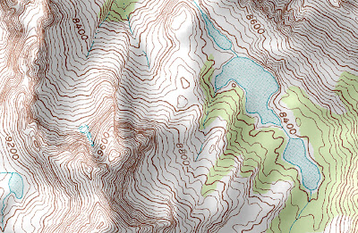
Unlike a planimetric map, topographic maps are very useful for seeing elevational differences between two spots on the same map. That is just what these maps are for: topographic maps use contour lines as well as three-dimensional shading relief to show the elevation of geographic features. This map, where elevation exceeds 9600 ft, is directly from a web article about topography and its use in cartography. Here we can not only see where there are hills or mountains from the look of raised features but also from the contour lines.


Friday, March 22, 2013

Planimetric Map

http://www.orangesmile.com/travelguide/florence/city-maps.htm

This is a road map of Florence, Italy. It is a planimetric map because it only shows the area and the places in the city horizontally; meaning there is no third dimensional aspect showing elevation or some particular landforms. For example, someone looking at this map would not be able to tell that the green area at the bottom of this map is very hilly/ mountainous. When you are at Piazzale Michealangelo, noted by the little red dot located in the middle of this green, you are atop the mountain and have a very clear view of all the city. Just looking at the map, you might not know it unless you know the area. 

Wednesday, March 20, 2013

Mental Map

http://georeferenced.wordpress.com/2010/06/08/forget-the-geoweb-%E2%80%93-let-children-map-our-world/

This map was on display at the "Magnificent Maps" exhibition at the British Library in London, which was closed in September of 2010. It is a mental map of the cartographer's own mind. Mental maps are maps that are thought up and projected in one's own mind. A child's drawing, or that of someone with a child-like mental ability, of an area they know is a perfect example of this. Young or unable to yet see the technicalities and ordered ways of geographically mapping out the world, they present an image of the world from their own pure thoughts and experiences. For example, in this map a plane does not represent an airport, it represents the way to Grandma's because the cartographer of this map relates going to the airport to going to visit their grandmother. The same could be said for the river: this artist does not "travel to the river", they simply "go swimming" at that location.